‘‘
Designing for e-commerce was a unique experience for me, and I’m grateful it turned out the way it did
‘‘
Designing for e-commerce was a unique experience for me, and I’m grateful it turned out the way it did
‘‘
Designing for e-commerce was a unique experience for me, and I’m grateful it turned out the way it did
05
05
05
05
QUICK CHECKOUT POSSIBILITY
QUICK CHECKOUT POSSIBILITY
QUICK CHECKOUT POSSIBILITY
QUICK CHECKOUT POSSIBILITY
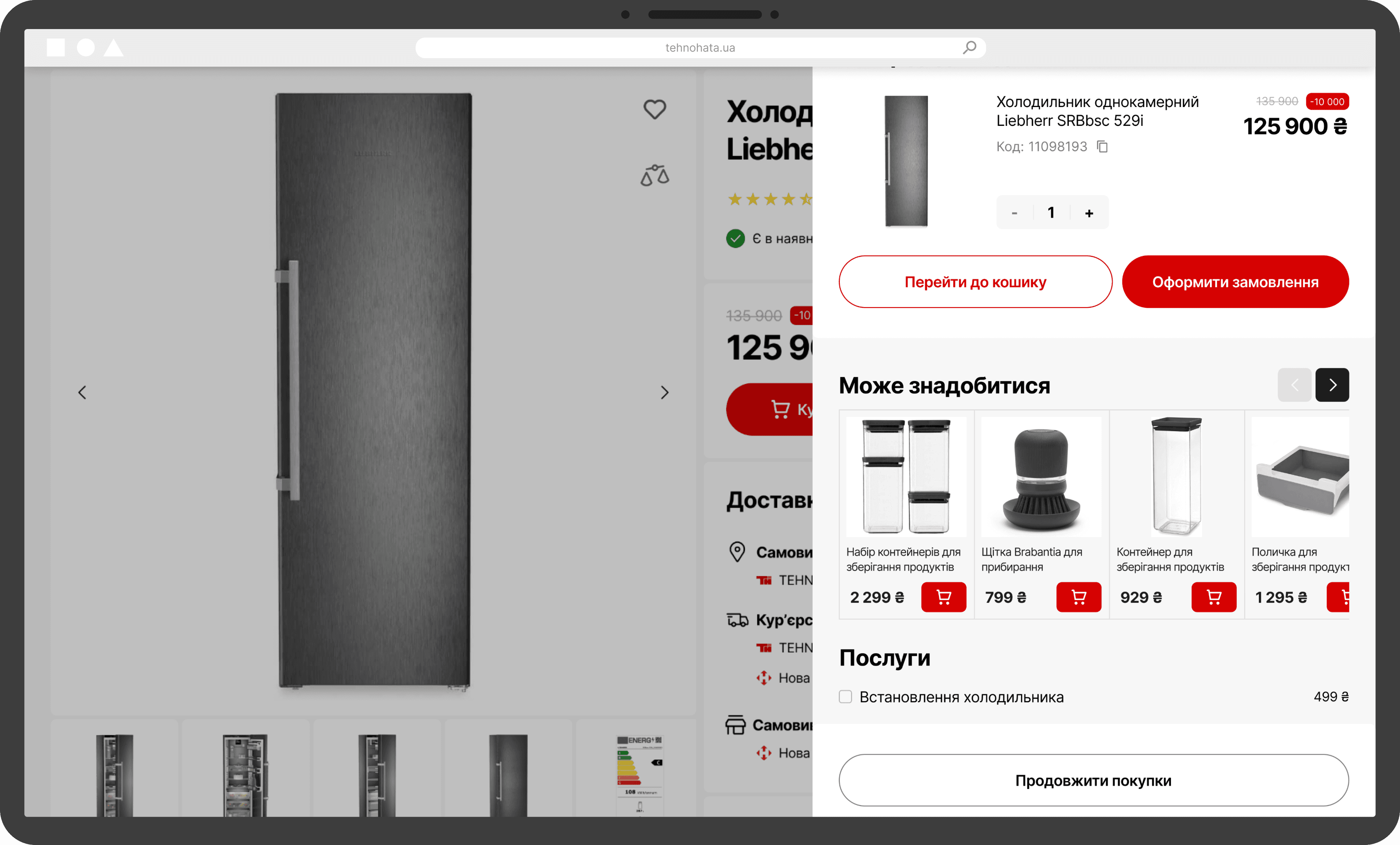
When a user adds a product to the cart, it’s important to keep the purchase flow smooth and efficient. To support that, I introduced a compact mini cart that appears instantly which allows the user to proceed directly to checkout without unnecessary steps.
This mini cart also includes additional CTAs like “Go to Cart” and “Continue Shopping,” making it flexible for different user intentions.
Plus, it features a cross-sell section with relevant accessories and services to enhance the order and increase average cart value.
06
06
06
06
FIXED CONFIRMATION
FIXED CONFIRMATION
FIXED CONFIRMATION
FIXED CONFIRMATION
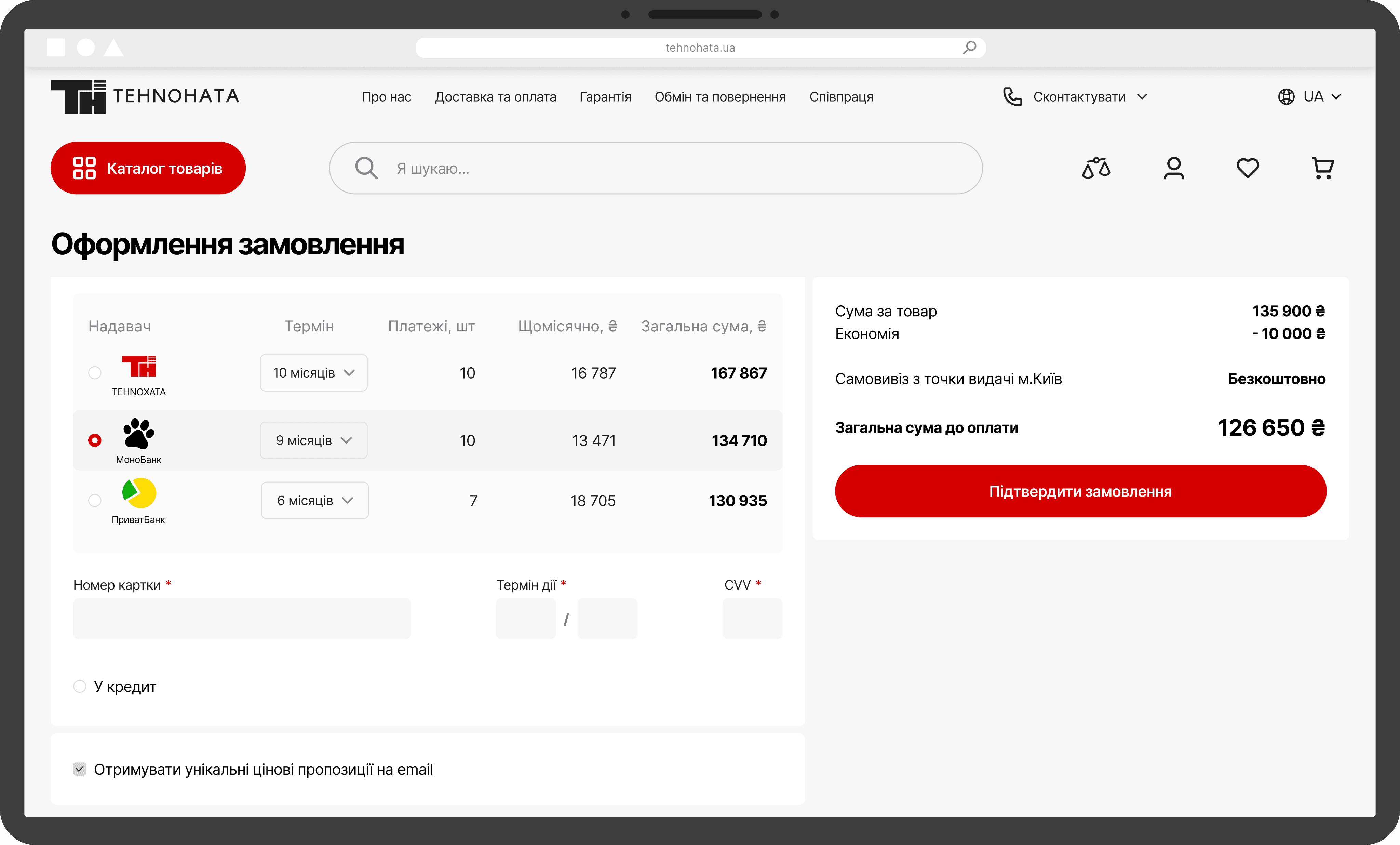
Once the users proceed to checkout, they need to fill in key details like delivery and payment information.
However, as they scroll down through the form, the final CTA can easily get lost. To prevent this and keep the experience seamless, I fixed the “Confirm Order” CTA so it remains visible at all times.
So that, it’s reducing friction, speeding up the process, and helping increase successful order completions.
Once the users proceed to checkout, they need to fill in key details like delivery and payment information.
However, as they scroll down through the form, the final CTA can easily
get lost. To prevent this and keep the experience seamless, I fixed the “Confirm Order” CTA so it remains visible at all times.
So that, it’s reducing friction, speeding up the process, and helping increase successful order completions.
Once the users proceed to checkout, they need to fill in key details like delivery and payment information.
However, as they scroll down through the form, the final CTA can easily get lost. To prevent this and keep the experience seamless, I fixed the “Confirm Order” CTA so it remains visible at all times.
So that, it’s reducing friction, speeding up the process, and helping increase successful order completions.
Once the users proceed to checkout, they need to fill in key details like delivery and payment information.
However, as they scroll down through the form, the final CTA can easily get lost. To prevent this and keep the experience seamless, I fixed the “Confirm Order” CTA so it remains visible at all times.
So that, it’s reducing friction, speeding up the process, and helping increase successful order completions.

07
07
07
07
NO FOOTER ON CHECKOUT
NO FOOTER ON CHECKOUT
NO FOOTER ON CHECKOUT
NO FOOTER ON CHECKOUT
Any element that interrupts the user’s purchasing flow can negatively impact conversions, especially during critical steps like checkout.
To keep the user fully focused on completing their order, I removed the footer from the checkout page. This reduces distractions and pays more attention to the essential form fields, such as delivery and payment, and the primary CTA, “Confirm Order.”
Let’s continue with brand identity
Let’s continue with brand identity
Let’s continue with brand identity
Let’s continue with brand identity
HOW I INTEGRATED BRAND IDENTITY INTO UI
HOW I INTEGRATED BRAND IDENTITY INTO UI
HOW I INTEGRATED BRAND IDENTITY INTO UI
HOW I INTEGRATED BRAND IDENTITY INTO UI
[ 06 / 07 ]
[ 06 / 07 ]
The client provided a brand colour palette, with the first three colours as primary. They also requested a light background for the website and red as the main accent colour.
I incorporated these preferences into the design, and introduced the fourth and fifth colours in selected block to create visual balance and hierarchy.
Additionally, the client had a custom graphic element, which I used in promotional banners across the site to reinforce brand identity.
To maintain clarity and avoid overwhelming the user, I chose the Inter typeface — a clean, modern font known for its high readability.
COLOURS
COLOURS
COLOURS
#1D1E1C
#1D1E1C
#1D1E1C
#D50000
#D50000
#D50000
#FFFFFF
#FFFFFF
#FFFFFF
#797B84
#797B84
#797B84
#FDF2F2
#FDF2F2
#FDF2F2
GRAPHIC ELEMENTS
GRAPHIC ELEMENTS
GRAPHIC ELEMENTS
TYPOGRAPHY
TYPOGRAPHY
TYPOGRAPHY
INTER
[ headlines & body text]
‘‘
These decisions were applied to the main and product card screens.
Now, let’s move on to the cart and checkout pages
‘‘
These decisions were applied to the main and product card screens.
Now, let’s move on to the cart and checkout pages
‘‘
These decisions were applied to the main and product card screens.
Now, let’s move on to the cart and checkout pages
‘‘
These decisions were applied to the main and product card screens.
Now, let’s move on to the cart and checkout pages
KEY DESIGN DECISIONS
KEY DESIGN DECISIONS
KEY DESIGN DECISIONS
KEY DESIGN DECISIONS
Since the design was created for an e-commerce website, the goal was to increase revenue through cross-sell blocks, smart design decisions, and a strong focus on user-centered experiences
Since the design was created for an e-commerce website, the goal was to increase revenue through cross-sell blocks, smart design decisions, and a strong focus on user-centered experiences
[ 05 / 07 ]
[ 05 / 07 ]
Since the design was created for an e-commerce website, the goal was to increase revenue through cross-sell blocks, smart design decisions, and a strong focus on user-centered experiences
01
01
01
01
SELLS VIA MAIN BANNER
SELLS VIA MAIN BANNER
SELLS VIA MAIN BANNER
SELLS VIA MAIN BANNER
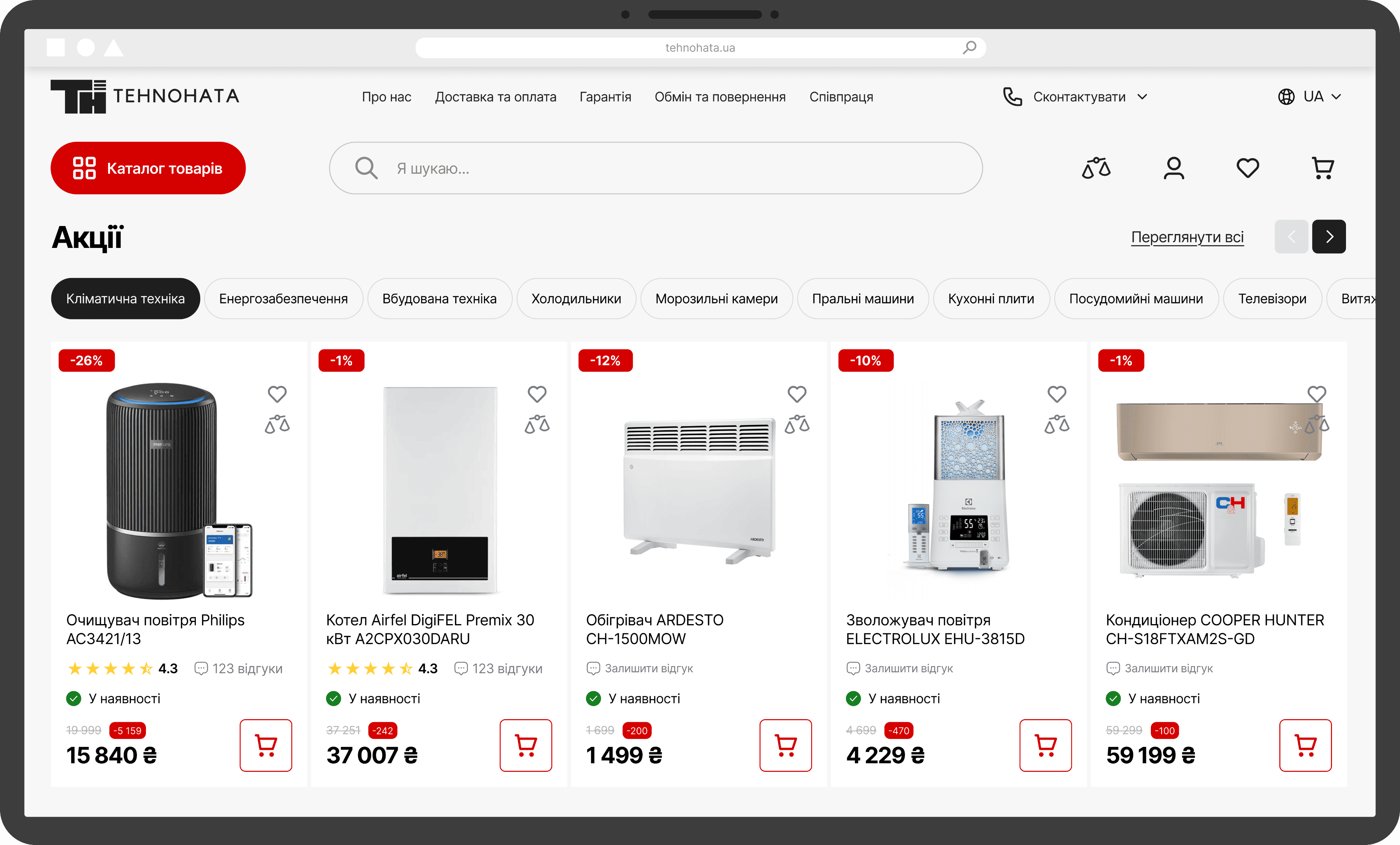
Since the store focuses on home appliances, it’s important that users feel both confident in product reliability and a sense of home comfort when they visit the website.
To support this, I used the main banner to showcase catalog items in a real-life home setting, helping users instantly imagine how these products could fit into their own space.
Additionally, I created a well-structured, extensive catalog to make product discovery easier and improve the overall shopping experience.
Since the store focuses on home appliances, it’s important that users feel both confident in product reliability and a sense of home comfort when they visit the website.
To support this, I used the main banner to showcase catalog items in a real-life home setting — helping users instantly imagine how these products could fit into their own space.
Additionally, I created a well-structured, extensive catalog to make product discovery easier and improve the overall shopping experience.
Since the store focuses on home appliances, it’s important that users feel both confident in product reliability and a sense of home comfort when they visit the website.
To support this, I used the main banner to showcase catalog items in a real-life home setting, helping users instantly imagine how these products could fit into their own space.
Additionally, I created a well-structured, extensive catalog to make product discovery easier and improve the overall shopping experience.
Since the store focuses on home appliances, it’s important that users feel both confident in product reliability and a sense of home comfort when they visit the website.
To support this, I used the main banner to showcase catalog items in a real-life home setting, helping users instantly imagine how these products could fit into their own space.
Additionally, I created a well-structured, extensive catalog to make product discovery easier and improve the overall shopping experience.

02
02
02
02
TABS SECTION
TABS SECTION
TABS SECTION
TABS SECTION
The store offers a wide range of discounted products, so I enhanced the standard discount block by adding tabs with product specifications.
This small UX improvement makes a big difference because it allows users to browse discounted items by category right from the main screen, helping them quickly find relevant deals and potentially boost sales.
03
03
03
03
CROSS-SELL BLOCK
CROSS-SELL BLOCK
CROSS-SELL BLOCK
CROSS-SELL BLOCK
While purchasing a product, users often want to complete the experience by adding accessories or useful services. Redirecting them to separate pages can interrupt the flow and reduce the chance of conversion.
To keep users engaged and make the process seamless, I added a cross-sell block on the product page. It offers helpful add-ons the user might need, so that it’s easier to find everything in one place. Also, it increases the possibility of a successful purchase.

04
04
04
04
FIXED POSITION CART
FIXED POSITION CART
FIXED POSITION CART
FIXED POSITION CART
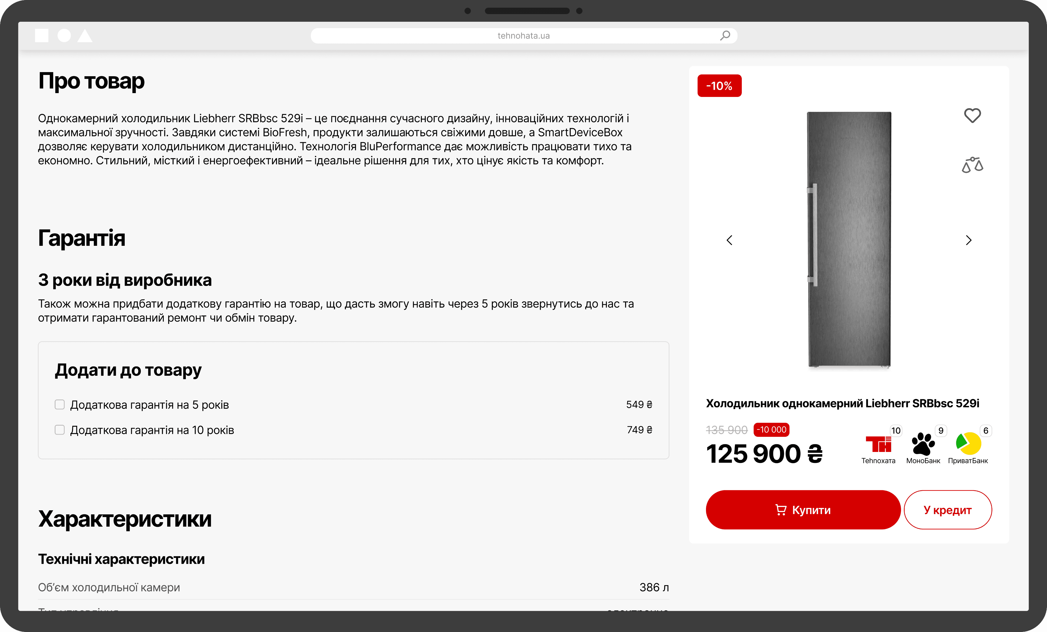
While users explore product details, such as specifications, guarantee and reviews, a product card is fixed on the right side of the screen.
This ensures the CTA to purchase is always visible, reducing time in the buying process and making it easier for users to complete their purchase at any point during their process.
‘‘
Identifying the core problem and solutions is essential for smart design decisions.
Here are the ones I applied in this project
‘‘
Identifying the core problem and solutions is essential for smart design decisions.
Here are the ones I applied in this project
‘‘
Identifying the core problem and solutions is essential for smart design decisions.
Here are the ones I applied in this project
WHAT I DID IN PROJECT
WHAT I DID IN PROJECT
WHAT I DID IN PROJECT
WHAT I DID IN PROJECT
[ 01 / 07 ]
[ 01 / 07 ]
In this project, I created all the needed pages to proceed from the main page to the checkout, including the process of prototyping
In this project, I created all the needed pages to proceed from the main page to the checkout, including the process of prototyping
01
Did a quick research to gain better insights about the users
Did a quick research to gain better insights about the users
01
Did a quick research to gain better insights about the users
01
Did a quick research to gain better insights about the users
02
Conducted usability testing on the Hi-Fi prototype
Conducted usability testing on the Hi-Fi prototype
02
Conducted usability testing on the Hi-Fi prototype
02
Conducted usability testing on the Hi-Fi prototype
03
Designed the full UI from the homepage to checkout
Designed the full UI from the homepage to checkout
03
Designed the full UI from the homepage to checkout
03
Designed the full UI from the homepage to checkout
04
Integrated UX solutions which increase conversion
Integrated UX solutions which increase conversion
04
Integrated UX solutions which increase conversion
04
Integrated UX solutions which increase conversion
05
Built a consistent UI system with hierarchy, grid and components
Built a consistent UI system with grid and components
05
Built a consistent UI system with hierarchy, grid and components
05
Built a consistent UI system with hierarchy, grid and components
OUTCOME
OUTCOME
OUTCOME
OUTCOME
[ 02 / 07 ]
[ 02 / 07 ]
While designing these screens, I had the main goal: to create a user-centered design that would bring this business higher revenue level. So, here are all the outcomes I received
While designing these screens, I had the main goal: to create a user-centered design that would bring this business higher revenue level. So, here are all the outcomes I received
8
screens of UI - from the homepage to checkout
screens of UI - from the homepage to checkout
8
screens of UI - from the homepage to checkout
8
screens of UI - from the homepage to checkout
7
component properties for product card states
component properties for product card states
7
component properties for product card states
7
component properties for product card states
5
designed banners which include brands identity
designed banners which include brands identity
5
designed banners which include brands identity
5
designed banners which include brands identity
8
business solutions integrated into design
business solutions integrated into design
8
business solutions integrated into design
8
business solutions integrated into design
1
fully responsible making order prototype
fully responsible making order prototype
1
fully responsible making order prototype
1
fully responsible making order prototype
LET’S GO TO PROJECT’S PROBLEM AND ITS SOLUTION
LET’S GO TO PROJECT’S PROBLEM AND ITS SOLUTION
LET’S GO TO PROJECT’S PROBLEM AND ITS SOLUTION
LET’S GO TO PROJECT’S PROBLEM AND ITS SOLUTION
PROBLEM
PROBLEM
PROBLEM
PROBLEM
The goal was to redesign the website, so that the design will be better and it will bring more money
[ 03 / 07 ]
[ 03 / 07 ]
The goal was to redesign the website, so that the design will be better and it will bring more money
The goal was to redesign the website, so that the design will be better and it will bring more money
The goal was to redesign the website, so that the design will be better and it will bring more money
outdated design
outdated design
not enough cross-sell block quantity
not enough cross-sell block quantity
SOLUTION
SOLUTION
SOLUTION
SOLUTION
Regarding these solutions, I was able to create a design that fully met the client's expectations
[ 04 / 07 ]
[ 04 / 07 ]
Regarding these solutions, I was able to create a design that fully met the client's expectations
Regarding these solutions, I was able to create a design that fully met the client's expectations
Regarding these solutions, I was able to create a design that fully met the client's expectations
redesign the website
redesign the website
add more cross-sell blocks
add more cross-sell blocks
make a quick order possibility
make a quick order possibility
NAVIGATION
NAVIGATION
NAVIGATION
NAVIGATION
Use this navigation to easily explore the key sections of the page
Use this navigation to easily explore the key sections of the page
Use this navigation to easily explore the key sections of the page
Use this navigation to easily explore the key sections of the page

TEHNOHATA
TEHNOHATA
TEHNOHATA
TEHNOHATA
[ e-commerce website ]
TEHNOHATA is an online home appliance store focused on bringing comfort and coziness to every home. The majority of products is large home appliances (refrigerators, washing machines, etc)
TEHNOHATA is an online home appliance store focused on bringing comfort and coziness to every home
TEHNOHATA is an online home appliance store focused on bringing comfort and coziness to every home. The majority of products is large home appliances (refrigerators, washing machines, etc)
WHAT I GOT FROM THE PROJECT
WHAT I GOT FROM THE PROJECT
WHAT I GOT FROM THE PROJECT
WHAT I GOT FROM THE PROJECT
Since the main task was to design the flow from the homepage to the checkout, I went through the entire journey and gained a lot of valuable insights along the way
Since the main task was to design the flow from the homepage to the checkout, I went through the entire journey and gained a lot of valuable insights along the way
[ 07 / 07 ]
[ 07 / 07 ]
Since the main task was to design the flow from the homepage to the checkout, I went through the entire journey and gained a lot of valuable insights along the way
conducting research on competitors, user journey, and pain points, especially in e-commerce, makes a foundation for an effective design
conducting research on competitors, user journey, and pain points, especially in e-commerce, makes a foundation for an effective design
if the budget allows, running usability tests on Hi-Fi wireframes before starting UI design can bring significant value to the business
if the budget allows, running usability tests on Hi-Fi wireframes before starting UI design can bring significant value to the business
integrating cross-sell blocks is often essential for increasing revenue
integrating cross-sell blocks is often essential for increasing revenue