HOW I INTEGRATED BRAND IDENTITY INTO UI
HOW I INTEGRATED BRAND IDENTITY INTO UI
HOW I INTEGRATED BRAND
IDENTITY INTO UI
HOW I INTEGRATED BRAND IDENTITY INTO UI
[ 07 / 08 ]
[ 07 / 08 ]
The client had already established the brand identity with specific colours and visual elements.
To give the layout more depth, I combined white blocks with Dry Grass. For body text, I used Very Dark Blue to ensure readability and contrast.
I selected the fourth graphic element and placed it on the hero section of the homepage — keeping the design clean yet branded.
For the headlines, I chose the 1990s outline version of NAMU. It offered perfect readability and proposed a confident character.
To give the layout more depth, I combined white blocks with Dry Grass. For body text, I used Very Dark Blue to ensure readability and contrast.
I selected the fourth graphic element and placed it on the hero section of the homepage keeping the design clean yet branded.
For the headlines, I chose the 1990s outline version of NAMU. It offered perfect readability and proposed a confident character.
The client had already established the brand identity with specific colours and visual elements.
To give the layout more depth, I combined white blocks with Dry Grass. For body text, I used Very Dark Blue to ensure readability and contrast.
I selected the fourth graphic element and placed it on the hero section of the homepage keeping the design clean yet branded.
For the headlines, I chose the 1990s outline version of NAMU. It offered perfect readability and proposed a confident character.
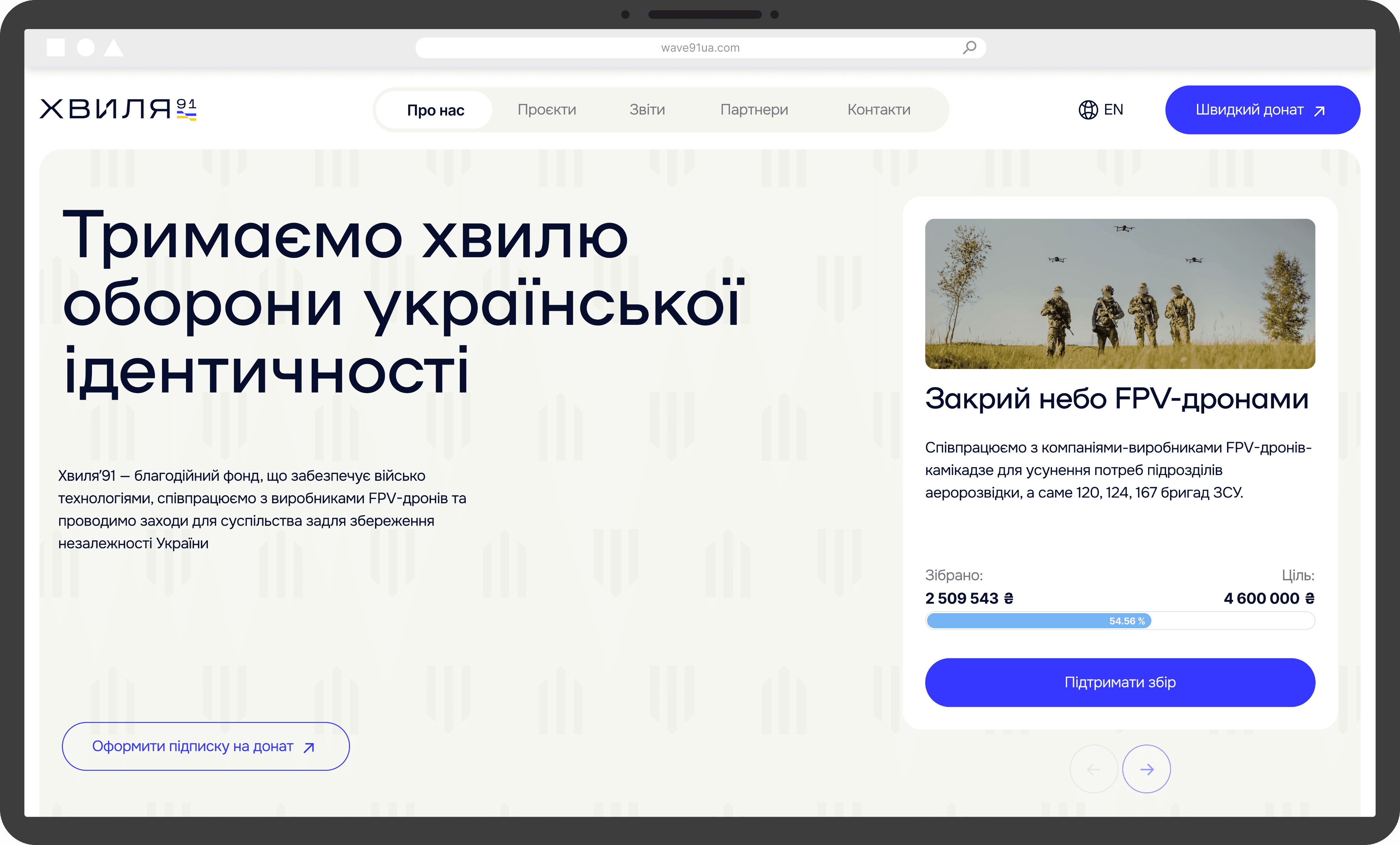
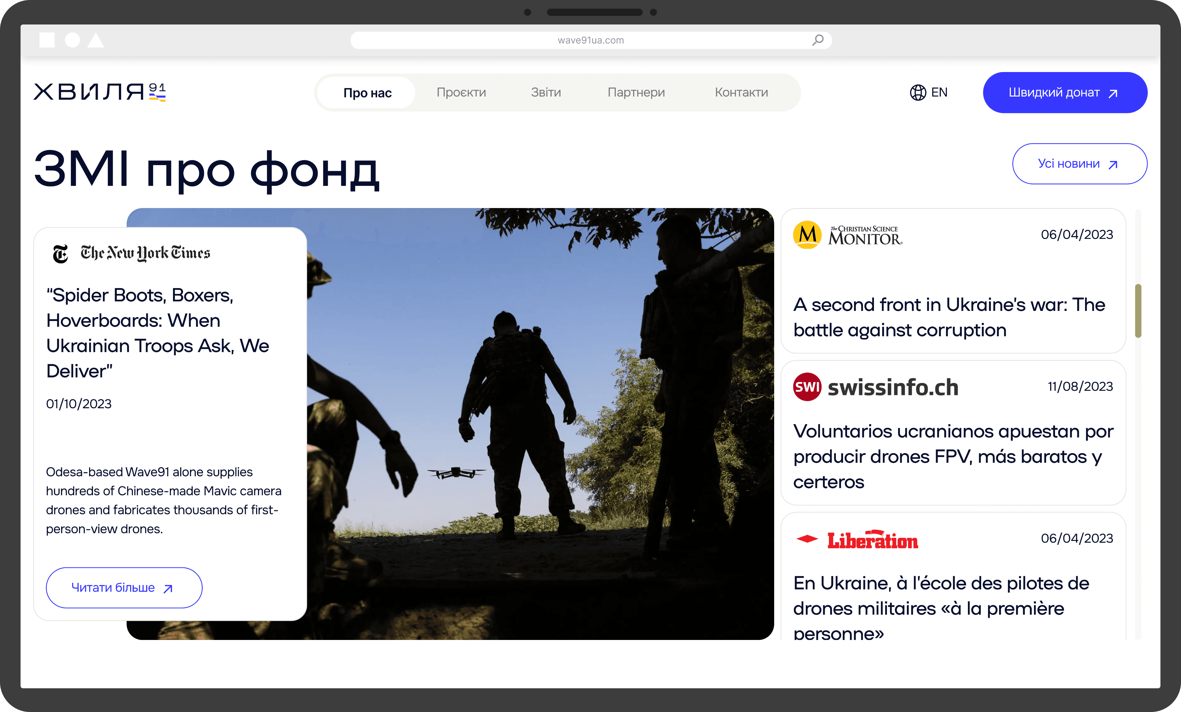
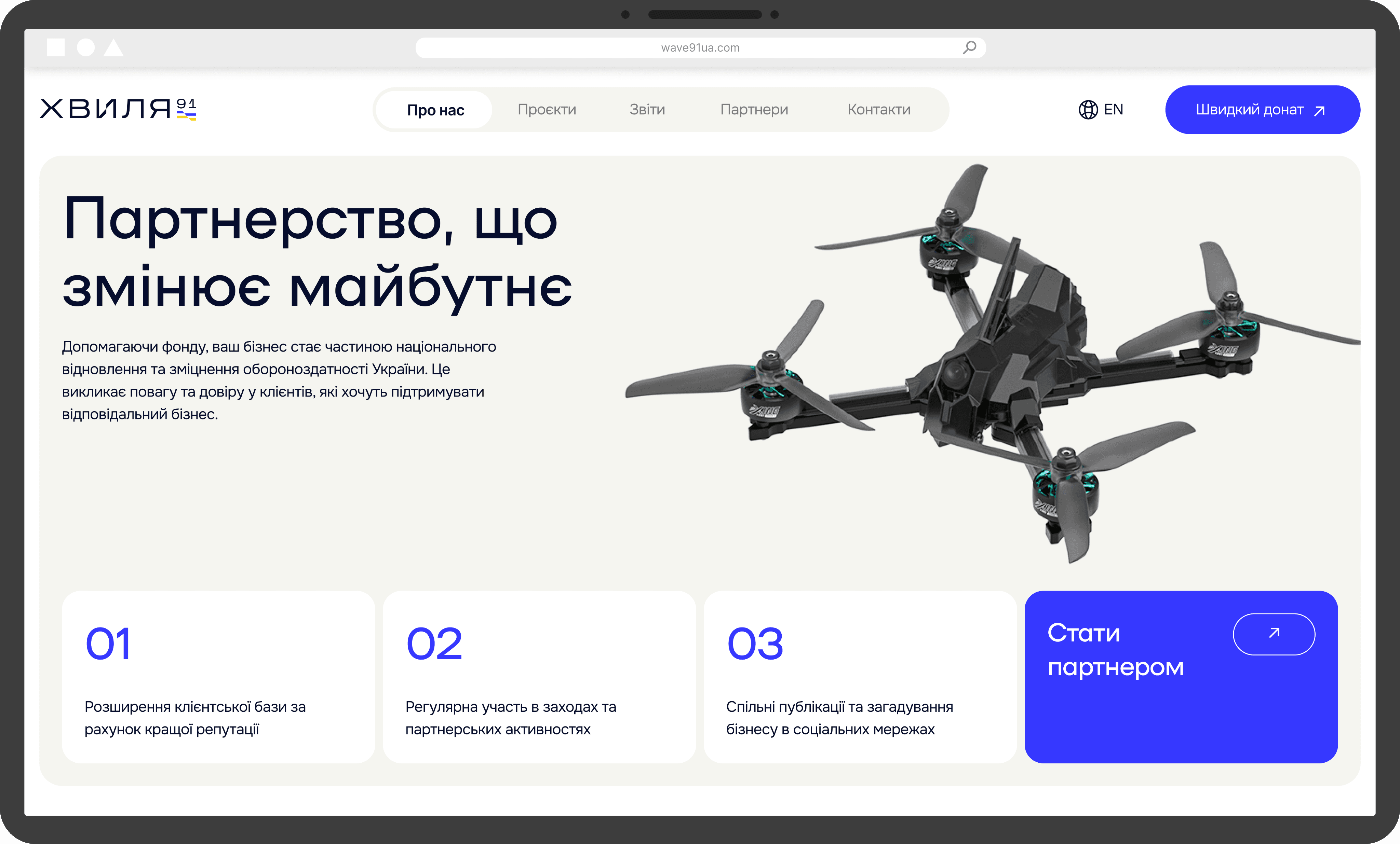
The client had already established the brand identity with specific colours and visual elements. I integrated the full colour palette into the design, using System Shock Blue as the main accent, especially for CTAs.
To give the layout more depth, I introduced background variation by combining white blocks with some Dry Grass at low opacity ones. For body text, I used Very Dark Blue to ensure readability and contrast.
Since using all the proposed graphic elements could overwhelm the layout, I selected just the fourth one and placed it on the hero section of the homepage keeping the design clean yet branded.
The client suggested using NAMU and ONEST as brand fonts. For the headlines, I chose the 1990s outline version of NAMU because it offered perfect readability and proposed a confident character.
COLOURS
COLOURS
COLOURS
#060D2D
#060D2D
#060D2D
#3638FF
#3638FF
#3638FF
#77B4F3
#77B4F3
#77B4F3
#A1A06B
#A1A06B
#A1A06B
#FFFFFF
#FFFFFF
#FFFFFF
GRAPHIC ELEMENTS
GRAPHIC ELEMENTS
GRAPHIC ELEMENTS
TYPOGRAPHY
TYPOGRAPHY
TYPOGRAPHY
NAMU (1990)
NAMU (1990)
NAMU (1990)
[ headlines ]
[ headlines ]
ONEST
ONEST
ONEST
[body text]
[body text]
KEY DESIGN DECISIONS
KEY DESIGN DECISIONS
KEY DESIGN DECISIONS
KEY DESIGN DECISIONS
Since this design was created for a charity foundation, the main goal was to build trust with users. Nearly every design decision was made with that in mind.
Since this design was created for a charity foundation, the main goal was to build trust with users. Nearly every design decision was made with that in mind.
[ 05 / 08 ]
[ 05 / 08 ]
Since this design was created for a charity foundation, the main goal was to build trust with users. Nearly every design decision was made with that in mind.
01
01
01
01
CHRONOLOGY
CHRONOLOGY
CHRONOLOGY
CHRONOLOGY
The homepage is clear, and the purpose from the main screen is to build trust and lead to action.
The website starts with the information about organisation, what’s urgent, and how to help. Then show real numbers and impact.
You see where the money goes: military support, detailed reports. Once trust is earned, I invite deeper connection: subscription, partnership and possibility of help.
Everything ends with one clear choice: act.
The homepage is clear, and the purpose from the main screen is to build trust and lead to action.
You see where the money goes: military support, detailed reports. Once trust is earned, I invite deeper connection: subscription, partnership and possibility of help.
Everything ends with one clear choice: act.
02
02
02
02
ACTION-FIRST CONTENT
ACTION-FIRST CONTENT
ACTION-FIRST CONTENT
ACTION-FIRST CONTENT
Every block comes with a clear way to act. At any point, users can jump in donation, subscription, or partner becoming.
People engage in different ways and at different moments. That’s why I placed clear CTAs throughout the page, so when someone feels ready to help, they don’t have to search for how.
It’s not about pressure, it’s about making support feel easy, timely, and natural.
Every block comes with a clear way to act. At any point, users can jump in — donate, subscribe, or become a partner.
When someone feels ready to help, they don’t have to search for how because I placed clear CTAs throughout the page.
It’s not about pressure — it’s about making support feel easy, timely, and natural.
Every block comes with a clear way to act. At any point, users can jump in donation, subscription, or partner becoming.
When someone feels ready to help, they don’t have to search for how because I placed clear CTAs throughout the page.
It’s not about pressure, it’s about making support feel easy, timely, and natural.
03
03
03
03
CLEAR TRUST
CLEAR TRUST
CLEAR TRUST
CLEAR TRUST
Since the website was created for a charity organization, building trust was essential. My goal was to include key elements that help users feel confident and inspired to donate.
At the same time, I was careful not to overwhelm the page with too many trust-building blocks. It was important to keep a balance between building trust and encouraging donations, without distracting users from the main goal of supporting the cause.
Since the website was created for a charity organization, building trust was essential. My goal was to include key elements that help users feel confident and inspired to donate.
It was important to keep a balance between building trust and encouraging donations, without distracting users from the main goal — supporting the cause.
Since the website was created for a charity organization, building trust was essential. My goal was to include key elements that help users feel confident and inspired to donate.
It was important to keep a balance between building trust and encouraging donations, without distracting users from the main goal of supporting the cause.
04
04
04
04
CONFIDENCE THROUGH VISUAL
CONFIDENCE THROUGH VISUAL
CONFIDENCE THROUGH VISUAL
CONFIDENCE THROUGH VISUAL
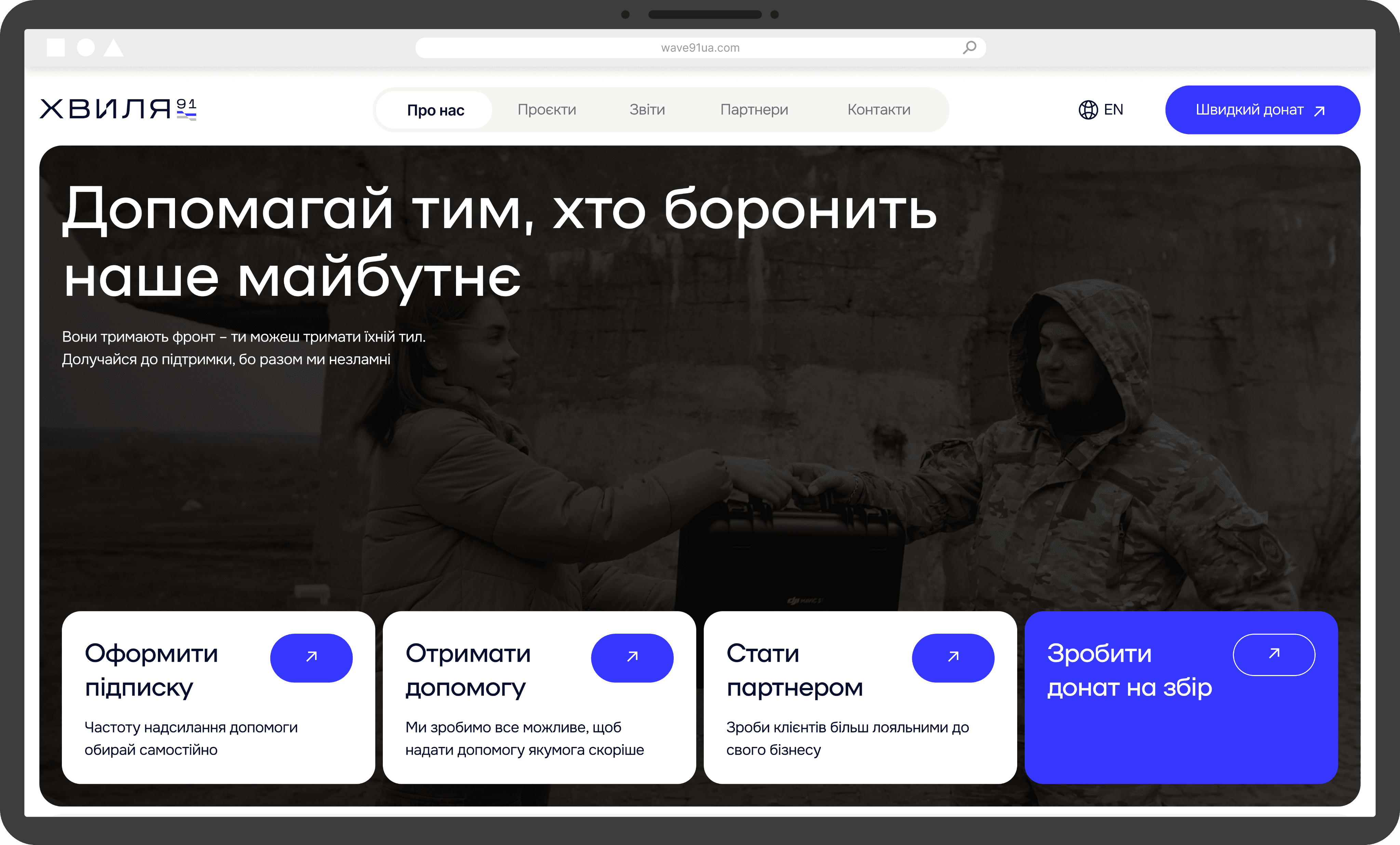
For a charity supporting both humanitarian and military efforts, the design had to inspire confidence and reflect the mission clearly.
I aimed to find a balance between a strict military look that could overwhelm, and a soft one that might feel too detached.
The result is a confident interface that supports both trust and action.
For a charity supporting both humanitarian and military efforts, the design had to inspire confidence and reflect the mission clearly.
I aimed to strike a balance — between a harsh military look that could overwhelm, and a soft one that might feel too detached.
The result is a confident interface that supports both trust and action.
For a charity supporting both humanitarian and military efforts, the design had to inspire confidence and reflect the mission clearly.
I aimed to find a balance between a strict military look that could overwhelm, and a soft one that might feel too detached.
The result is a confident interface that supports both trust and action.
For a charity supporting both humanitarian and military efforts, the design had to inspire confidence and reflect the mission clearly.
I aimed to find a balance between a strict military look that could overwhelm, and a soft one that might feel too detached.
The result is a confident interface that supports both trust and action.
FROM DECISIONS TO ADAPTATION
FROM DECISIONS TO ADAPTATION
FROM DECISIONS TO ADAPTATION
FROM DECISIONS TO ADAPTATION
MOBILE ADAPTATION
MOBILE ADAPTATION
MOBILE ADAPTATION
MOBILE ADAPTATION
[ 06 / 08 ]
[ 06 / 08 ]
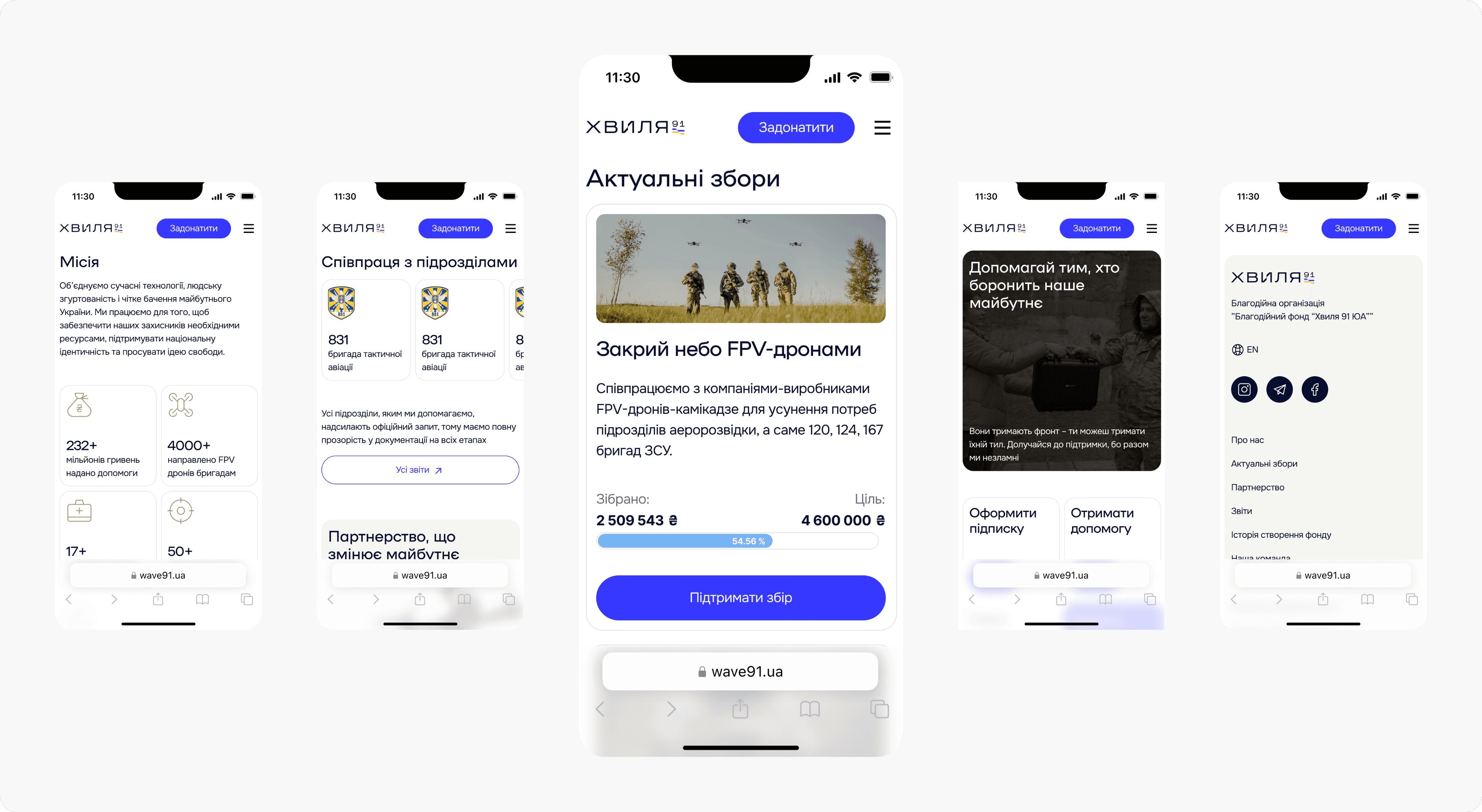
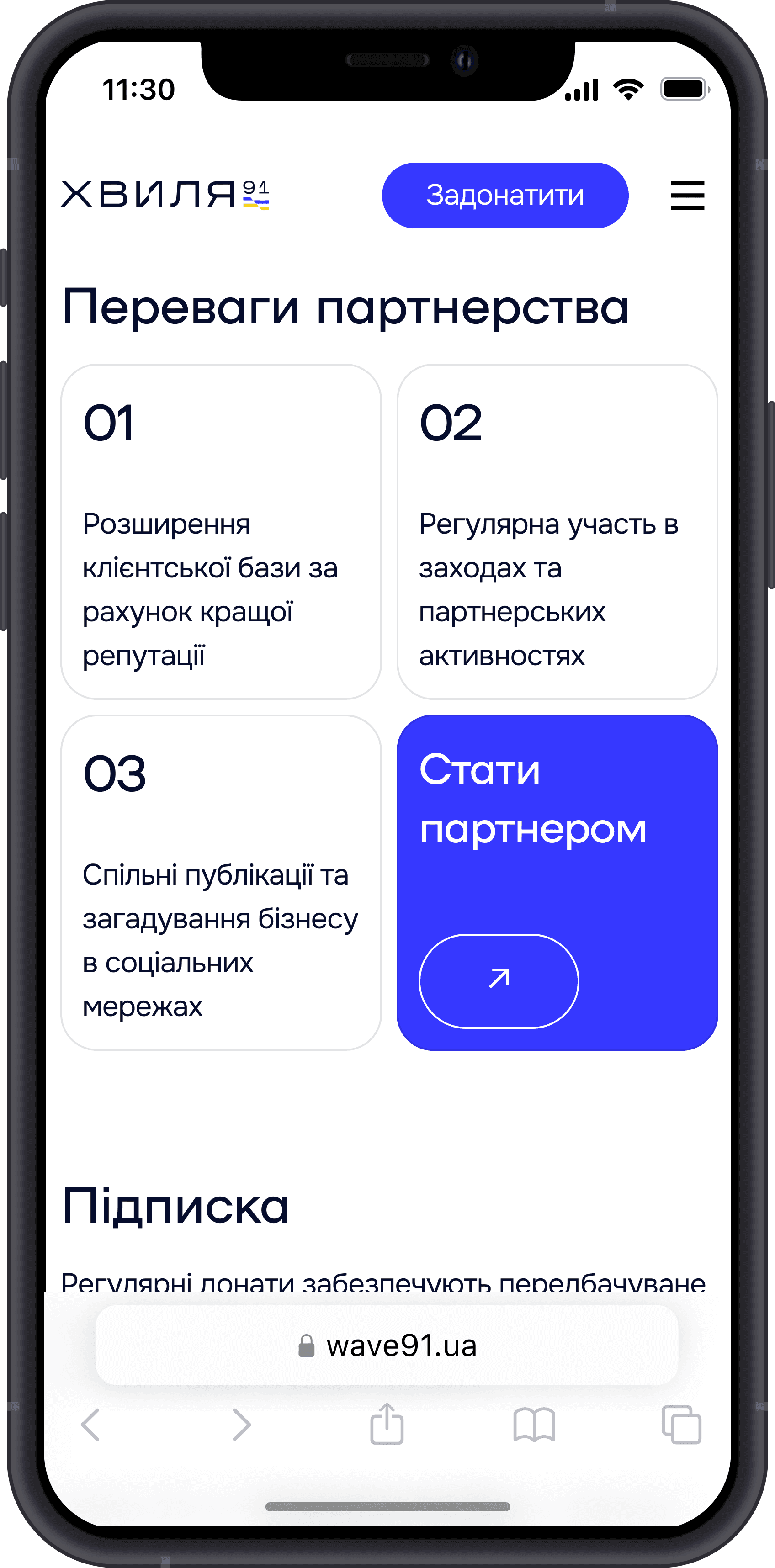
The main goal of the mobile adaptation was to preserve all key design blocks and decisions.
At the same time, it was important to prioritize content highlighting active fundraisers and moving secondary information into horizontal scrolls, which I implemented in the design.
Another key focus was placing CTAs across almost every block to encourage users to support the organization at every step.
‘‘
So, after defining the problem and solution, it’s time to tell the main key design decisions I made to create the perfect design
‘‘
So, after defining the problem and solution, it’s time to tell the main key design decisions I made to create the perfect design
‘‘
So, after defining the problem and solution, it’s time to tell the main key design decisions I made to create the perfect design
WHAT I DID IN PROJECT
WHAT I DID IN PROJECT
WHAT I DID IN PROJECT
WHAT I DID IN PROJECT
[ 01 / 08 ]
[ 01 / 08 ]
In this project, I was involved in creating the design of the main page to start its styling. So here is a list of what I have done in this project
In this project, I was involved in creating the design of the main page to start its styling. So here is a list of what I have done in this project
01
01
Created homepage structure for both desktop and mobile
Created homepage structure for both desktop and mobile
01
Created homepage structure for both desktop and mobile
01
Created homepage structure for both desktop and mobile
02
02
Redesigned UI according to the brand’s visual identity
Redesigned UI according to the brand’s visual identity
02
Redesigned UI according to the brand’s visual identity
02
Redesigned UI according to the brand’s visual identity
03
03
Built a clear visual hierarchy to enhance trust
Built a clear visual hierarchy to enhance trust
03
Built a clear visual hierarchy to enhance trust
03
Built a clear visual hierarchy to enhance trust
04
04
Designed UX solutions for different user groups
Designed UX solutions for different user groups
04
Designed UX solutions for different user groups
04
Designed UX solutions for different user groups
05
05
Designed a donate subscription block to boost regular support
Designed a donate subscription block to boost regular support
05
Designed a donate subscription block to boost regular support
05
Designed a donate subscription block to boost regular support
OUTCOME
OUTCOME
OUTCOME
OUTCOME
[ 02 / 08 ]
[ 02 / 08 ]
It’s hard to show the impact from the main page, so here are the key outcomes this project achieved through my work
It’s hard to show the impact from the main page, so here are the key outcomes this project achieved through my work
6
sections for donations and partnerships boost
sections for donations and partnerships boost
6
sections for donations and partnerships boost
6
sections for donations and partnerships boost
7
content blocks built to strengthen trust
content blocks built to strengthen trust
7
content blocks built to strengthen trust
7
content blocks built to strengthen trust
1
fully informative, adapted mobile version
fully informative, adapted mobile version
1
fully informative, adapted mobile version
1
fully informative, adapted mobile version
Understanding problems. Creating solutions that matter
Understanding problems. Creating solutions that matter
Understanding problems. Creating solutions that matter
Understanding problems. Creating solutions that matter
[ 03 / 08 ]
PROBLEM
PROBLEM
PROBLEM
PROBLEM
The goal was to redesign the website, and our briefing helped reveal the core issues
The goal was to redesign the website, and our briefing helped reveal the core issues
The goal was to redesign the website, and our briefing helped reveal the core issues
[ 03 / 08 ]
[ 03 / 08 ]
no confidence in visual design
no confidence in visual design
no donate subscriptions on website
no donate subscriptions on website
insufficient block quantity that enhance user's trust to make donations
insufficient block quantity that enhance user's trust to make donations
SOLUTION
SOLUTION
SOLUTION
SOLUTION
Here are the key actions I took to turn the website into a functional and user-friendly design
[ 04 / 08 ]
[ 04 / 08 ]
Here are the key actions I took to turn the website into a functional and user-friendly design
Here are the key actions I took to turn the website into a functional and user-friendly design
Here are the key actions I took to turn the website into a functional and user-friendly design
use new brand identity and drone visuals to boost confidence
use new brand identity and drone visuals to boost confidence
created a subscription block and integrated its CTAs across other help sections
created a subscription block and integrated its CTAs across other help sections
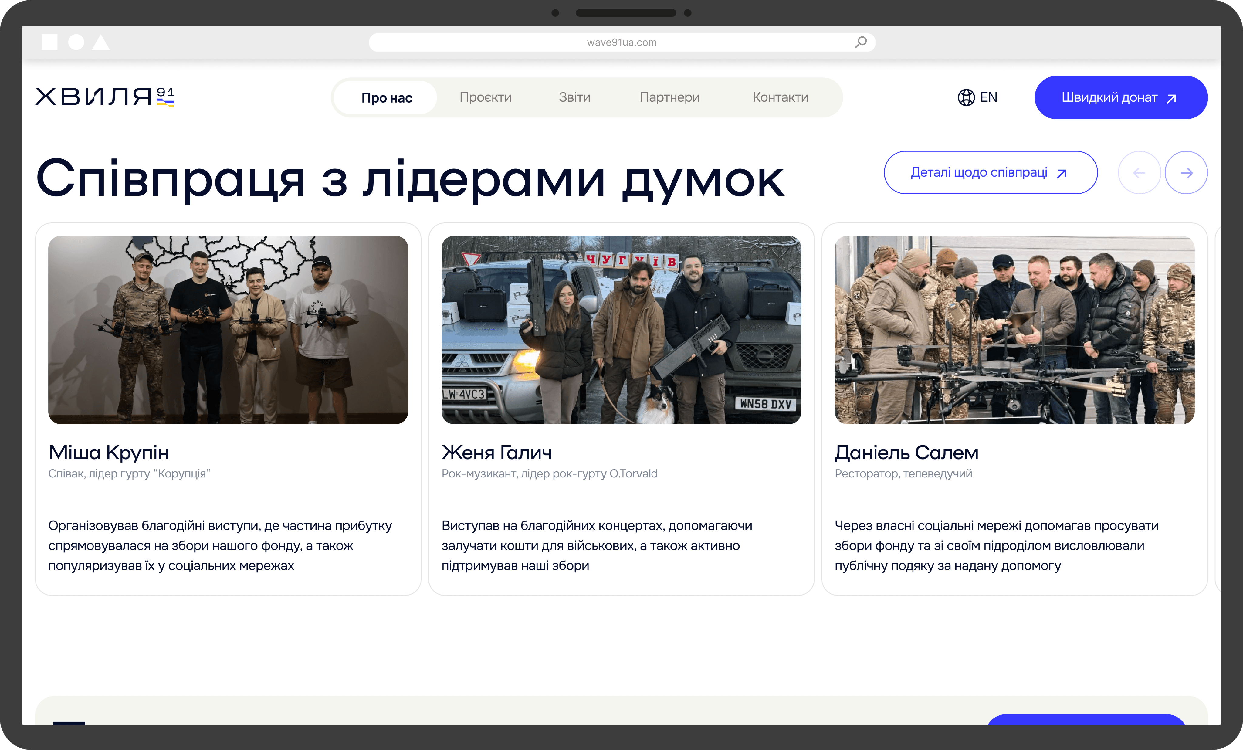
build trust through partnerships, media presence, influencers, and clear communication
build trust through partnerships, media presence, influencers, and clear communication
NAVIGATION
NAVIGATION
NAVIGATION
NAVIGATION
Use this navigation to easily explore the key sections of the page
Use this navigation to easily explore the key sections of the page
Use this navigation to easily explore the key sections of the page
Use this navigation to easily explore the key sections of the page

WAVE91
WAVE91
WAVE91
WAVE91
[ website ]
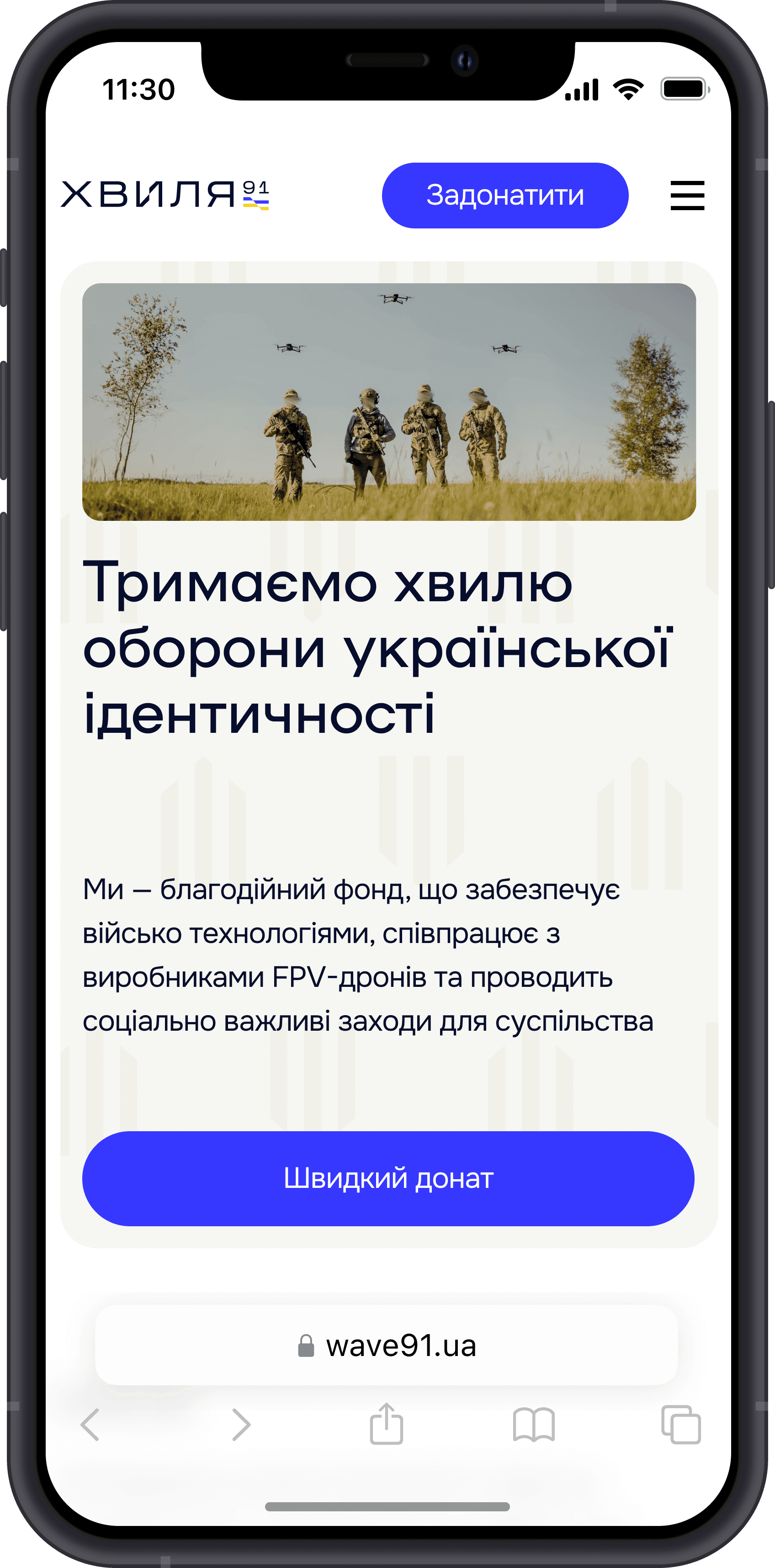
Wave91 is a charitable foundation that strengthens Ukraine’s defense by delivering FPV drones to the frontlines and fostering civic engagement
Wave91 is a charitable foundation that strengthens Ukraine’s defense by delivering FPV drones to the frontlines and fostering civic engagement
WHAT I GOT FROM THE PROJECT
WHAT I GOT FROM
THE PROJECT
WHAT I GOT FROM THE PROJECT
WHAT I GOT FROM THE PROJECT
Since it was my first time working on a mobile adaptation, I learned a lot through this project
Since it was my first time working on a mobile adaptation, I learned a lot through this project
[ 08 / 08 ]
[ 08 / 08 ]
Since it was my first time working on a mobile adaptation, I learned a lot through this project.
Since it was my first time working on a mobile adaptation, I learned a lot through this project.
knew some features of mobile adaptation
knew some features of mobile adaptation
investigated how to integrate brand identity to the design
investigated how to integrate brand identity to the design
had a unique experience creating a design that should earn full trust from the user
had a unique experience creating a design that should earn full trust from the user